Every year, I try to write a post about books that I’ve read in the past year. This time, I found myself writing so much about some of the books, that the post was getting unmanageably large. So I’ve split it in two. This is part one; part two will follow.
Geoff Eley, Forging Democracy: The History of the Left in Europe, 1850–2000. This book should be required reading for anyone who wants to build on the traditions of radical politics, especially those in conversation with Marxism. If you read this blog, and you haven’t read this book, you should go read it. (You can come back here in a month or whenever when you’re done.)
This is a genuine history of movements, not of parties or political leaders or theorists. It’s striking how many of the quotes are attributed to roles (“a contemporary union leader”, “a Vienna suffragist”) rather than to named individuals. The book’s title is well chosen: The central theme is that the project of socialism is the extension of collective self-government to all of social life, including the organization of production. Socialism, in other words, is simply a continuation of the struggle for political rights.
The term social democracy — which today suggests an anodyne reformism — meant originally a program to extend democratic principles from the demarcated political sphere to the rest of society, in particular the economy. The party, let’s not forget, that the Bolsheviks and the Mensheviks were factions of, was the Russian social democratic party. This continuity between from the battle for democratic rights — and later against fascism — to socialist politics comes through very clearly here.
This is not just a history of socialist parties, and much of the book — especially in the earliest and the latest, post-1968 sections — is devoted to non-electoral formations. But party politics is central, and for good reason. In many ways it was socialists who invented modern political parties. Electoral politics was originally an arena for competition between personality- and patronage-based fractions of the elite. It was only once socialists and their labor allies invented mass organizations for contesting the ballot that centrist and conservative parties developed in response. There is an important figure-ground reversal here from the Whiggish liberal conventional wisdom in which parliamentary politics is the ground on which socialist politics occupies (usually small) part.
One thing you will come away from this book with is a sense of how much the terrain of political struggle has shifted over time. It’s like a 500-page working-out of the William Morris line that “men fight and lose the battle, and the thing that they fought for comes about in spite of their defeat, and when it comes turns out not to be what they meant, and other men have to fight for what they meant under another name.” It is tempting, today, to look back on the debates of the past as having had right side and wrong side, and to think that what we learn form them is to take correct position rather than the incorrect one. But what a history like this makes clear is that the right and wrong positions, to the extent we can identify them even in retrospect, were right and wrong with respect to conditions at the time of that debate. What was wrong at one time may very well be right at another — or simply irrelevant.
Which doesn’t mean that we shouldn’t learn from the past, or that there isn’t a great deal to learn from it.
One lesson that comes through clearly is how much the progress over the past 200 years has been won in a few brief windows. Advances for human freedom and equality are real and, so far, irreversible; but they have been episodic rather than incremental. Besides the period of the French Revolution (outside of the scope of the book), the two great periods of revolutionary change are the decade or so during and following each of the world wars. The basic contours of electoral democracy were only firmly established in the wake of the revolutionary transformations of the First World War; the welfare state, the recognition of women’s humanity and the end of colonial empires in the wake of the Second.
The thing to remember here is that these changes were not inevitable. They did not just happen. They were the result of titanic struggles from below — struggles which however were often aiming at other goals, which they often failed to achieve.
A few other throughlines. One is that working-class movements have been led by relatively privileged workers. Unskilled workers are capable of occasional convulsive uprisings, but at the the core of sustained working class institutions have been workers with some degree of autonomy and social power — skilled artisans in the 19th century, machine workers and then educated white-collar white workers in the 20th. Another sustained theme: Utopians are essential to more practical movements. A vision of a radically different world provides the energy required for even incremental improvements.
Perhaps the most important lesson of the book is that the great left victories have come when radical, disruptive anti-systemic mass movements have worked in concert with parties of government. The same people, the same organizations can never be both; but each requires the other. To put it another way: The content of elections comes from the possibility of riots and barricades, the value of riots comes from the possibility of state power. The existence of political democracy in any substantive sense is the flip side of the possibility of disruptive challenge from below.
All this is very broad-brush and abstract; most likely you either already agreed with it, or you don’t. If you want nuance, evidence, concrete examples — well then you have to read the book.
Han Kang, Human Acts and We Do Not Part. Thanks to Arjun for introducing me to Kang; these are two of the most powerful novels I’ve read in quite a while.
The two books have a similar structure: Each takes a historic atrocity by Korea’s US-backed military governments — the Gwangju uprising of 1980 in Human Acts, the lesser known but even bloodier Jeju massacres of 1948-49 in We Do Not Part — and follows the aftermath down to the present, exploring how people live with its memory. In both there is a certain supernatural aspect to the afterlife of the victims. Both ask how it is possible to live when one knows that one’s government, one’s country, the respectable people in authority, have committed indescribable crimes that have never been accounted for.
Human Acts begins in the midst of the Gwangju uprising and then moves forward in time, looking at the events from the perspective of various participants — two young men who were killed, a blue-collar worker who was imprisoned and tortured, a journalist, a publisher struggling with military censors, a writer who resembles Han Kang. We Do Not part goes in the other direction, starting with a Kang-like writer (perhaps the same one) in a personal crisis, whose act of kindness for a friend carries her backward to the mass murder of suspected communists at the start of the Korean War. It ends with an indelible image of hope in darkness that is almost, but not quite, extinguished.
Both are beautiful books; I cannot recommend them too highly.
Brett Christophers, The Price is Wrong: Why Capitalism Won’t Save the Planet. I originally picked this up with the intention of writing something about it, which I did not end up doing. It was a frustrating read to me — I like the author and am very sympathetic to his broader worldview, and there’s a lot of specific information in this book that is valuable and compelling. But I am unconvinced by the book’s central argument.
A proper critique of the book deserves far more space, which I still hope to give it at some point. But here’s the short version.
The core of Christophers’ argument is that while the cost of renewable energy is falling rapidly, that does not mean that the private power companies will adopt it. They are motivated by profit, and renewables, despite being cheaper, are not more profitable. So a transition away from fossil-fuel based electricity generation will also require a transition to public ownership, or to a non-capitalist economy more broadly.
I believe down to my bones that moving away from the pursuit of profit as the organizing principle of social life is possible, and necessary, and matters for almost everything. But I don’t think Christophers’ argument gets you there.
There are a couple basic problems with his argument. First, profit is the difference between the sale price of a commodity and its cost of production. So to say anything about differences in profit, across technologies or industries or over time, one needs to analyze the determination of cost and price independent of each other. But Christophers doesn’t do this. He instead frames his analysis in terms of the awkward portmanteau “cost-price.”
If you wanted to take his analysis seriously, you would focus on the fact that in a competitive market, price tends toward marginal cost. If marginal cost is constant or falls with the level of production, and if fixed costs are substantial, then producers in a competitive market will face losses; such an industry won’t be viable in the long run. This was the situation of railways, for instance, in the late 19th century, which experienced repeated episodes of vicious price wars ending in general bankruptcy.
But capitalism is, of course, capable of producing railroads; this is because capitalism, despite some of its defenders’ claims, does not in general involve competitive markets. What we can say is that an industry like renewable energy, or railroads, requires a sufficient degree of monopoly power to enable it to recover its fixed costs. This is less of a problem for fossil fuels, where costs of production are a larger part of overall costs.
This problem is exacerbated by the specific way that electricity is priced in many markets, where the price is determined by the marginal producer. This was fine in an era where high-cost facilities would come online only when demand was high, raising profits for the rest of the industry. But when the marginal producer is a solar or wind facility, the price won’t cover fixed costs and the industry will make a loss. Christophers lays this out very well, and there’s no question it’s a real problem. But we should be clear: It’s a problem with how electricity prices are currently regulated. Not with clean energy or capitalism as such.
Second, let’s suppose that price-setting is such that a lower-cost production method will definitely lead to lower profits. Does that mean that profit-seeking capitalists will not adopt that method? Well no. Because there’s a critical distinction here between the individual enterprise, where production techniques are chosen, and the industry as a whole, where prices are set. If I can produce the same commodity at a lower cost than my competitors, then my profits will definitely increase. Perhaps, once the new method is generally adopted, everyone’s profits will be lower. But so what? I’m a capitalist! My own profits, now, are what I care about.
I admit that I am a little surprised that someone writing in the Marxist tradition doesn’t seem to have considered this possibility. This sort of collective-action problem among capitalists is the whole story of the tendency of the rate of profit to fall in Volume III of Capital. And it’s been a central subject of debate for Marxist economists ever since. I don’t necessarily expect Brett Christophers to have a settled view on the validity of the Okishio theorem. But I would kind of hope that he knows this conversation exists.
This is all very critical; but, to be clear, there’s a great deal in the book that is useful and insightful. The problem is, the conclusion that the concrete material points to is that we need better rules for regulating electricity prices. If you want to get to an argument against organizing production on the basis of profit, you would need to start from somewhere else.
Cixin Liu, The Three Body Problem. There was some mix-up at Christmas last year, where two copies of this were purchased and no one was sure whether they were for me, the 13-year old, or my college-age nephew. I think I was the only one of the three of us who eventually read one.
For all the attention it’s gotten, I thought it was … ok. Or rather, the first two-thirds, which combined a slice of life from the last 50 years of Chinese history with a weird and unsettlingly out-of-focus mystery, was pretty good; and the last third, which rushed to tie up and explain everything, deflated most of what the first part had promised. At the end of the day, real human history and relationships offer much richer alien world than anything might work out about a hypothetical civilization on some other planet.
Michael Lewis, Who Is Government? I sent my post on teachers — which I was very pleased with; you should read it if you have not — to N+1 before putting it up on the blog; they didn’t go for it, but they did ask me to review this book. I read the book, but never wrote the review: I’d kind of got the larger points I wanted to make out of my system with the teachers post, and there wasn’t enough substance in the book to do much with on its own.
The book, anyway, is edited by Michael Lewis; it’s a collection of admiring essays on federal employees, two by Lewis himself, the half-dozen others by various Atlantic–Harper’s–Washington Post type writers. Lewis’s essays are by a wide margin the best — whatever else you say about him, he really is a master of this type of storytelling. It helps that he chose interestingly offbeat subjects — a mine safety enforcer and an infectious-disease specialist — rather than the standard cop-astronaut-soldier palette of approved public occupations that the rest of the portraits are drawn from. I wouldn’t necessarily recommend buying this book; but if you see a copy in one of those little free library boxes on the street, you should take it out, read the two Lewis pieces, and then donate it to another one.
John Kay, The Corporation in the 21st Century. As I’ve mentioned, Arjun’s and my next book is on the contradictions of the corporation. (Our working title is Relations of Production.) So I’ve been reading a bit on that, for instance this. This book has a tremendous number of fascinating stories and sharp observations — it’s a goldmine for someone else writing on the corporation — but the whole is perhaps less than the sum of its parts. Still, there are lots of good bits. Here is one passage that I appreciated:
Neither Amazon nor Apple has raised any money from shareholders since their IPO, and neither is ever likely to in the future. Past stockholder investment represents less than .01 per cent of the current value of these businesses. Modern companies are typically cash-generative before they reach a scale at which they become eligible for a listing on a public market. The purpose of the IPO is not to raise capital but to demonstrate to earlier investors and employees that there is value in their shareholdings and to enable some to realise that value. The objective of listing on a stock exchange is not to put money into the business but to make it possible to take money out of the business.
Kay has some interesting ideas about the diminishing importance of capital ownership as such to the organization of production and the generation of profits. But to me, anyway, the book is more interesting for the examples than for the larger argument they’re meant to support.
Katya Hoyer, Beyond the Wall: East Germany, 1949-1990. This is a history of East Germany that strives for a sympathetic perspective without flinching from the facts. Unfortunately, the latter are not very cooperative with the former.
I am probably an ideal reader for this book — you will find few people more willing to dispute the idea that the good guys won the Cold War, or to defend the record of actually existing communism. And Hoyer does a good job complicating the story of East versus West. She emphasizes, for example, that Stalin had no interest in creating a separate German puppet state, and consistently directed Communist leaders there to focus on maintaining their legitimacy in an eventual united Germany; the idea of building a separate socialist state in the East was a local initiative. She notes that expropriation of private businesses in the East was not nearly as immediate or complete as Cold War mythology suggests, with many former owners willingly remaining as managers of their enterprises under state ownership. Not so different from an IPO, when you think about it.
She also makes the interesting and, to me, convincing argument that in the early years, migration to the west was the result of success as much as failure — the East combined an excellent technical education and training system with a very flat distribution of income, creating a large stratum of moderately privileged engineers and skilled workers who saw the opportunity for greater privilege in the West.
But ultimately, despite the successes (gender equality is another important one) it’s hard to find much positive to say about the East German leadership, and Hoyer’s story ends up being a rather dismal one. Keynes was very far from a Communist, but when he looked at the Soviet Union 100 years ago, he recognized that something new and important and genuinely promising was being attempted — that “beneath the cruelty and stupidity of New Russia some speck of the ideal may lie hid.” It would be much harder to say that about the cruelty and stupidity of the Ulbricht-Honecker regime.
Alice Munro, The Progress of Love. This is not Munro’s very best work — I would give that to Dear Life, Friend of My Youth, Friendship, Courtship, Loveship, Marriage and perhaps Runaway — but it’s certainly not her worst. And honestly even her worst is good.
As I noted on last year’s list, while I am generally on the side that says you can and should judge artistic work by the author’s personal conduct, I haven’t been able to give up Munro; I’ve been rereading her work since the revelations about her daughter came out. I dipped into various collections this year but this is the one I reread in full.
When you read her in that light, it’s striking how many stories there are about neglectful mothers who lose, or almost lose a young daughter, or who could have lost one if not for some miracle. (Very often it’s to drowning — I don’t know what that means.) The self-involved mother and (nearly) drowned child moment is one of a number of situations and characters she keeps coming back to in her stories — rereading, it’s more striking how many of them are variations on a few themes.
This repetition to me is one of the things that’s fascinating about Munro. It’s almost like she’s a scientist— she has some fundamental problem she’s working over, an experiment she keeps rerunning under slightly different conditions to see if the results change. Which points to, I think, the difference between her and Allen, Polanski, etc. — like them she failed as a human being, but unlike theirs her art is conscious of that failure and struggles with it. If Woody Allen could make a movie from the perspective of a brilliant young female writer struggling with the attention of a lecherous older mentor, I might give him another chance.
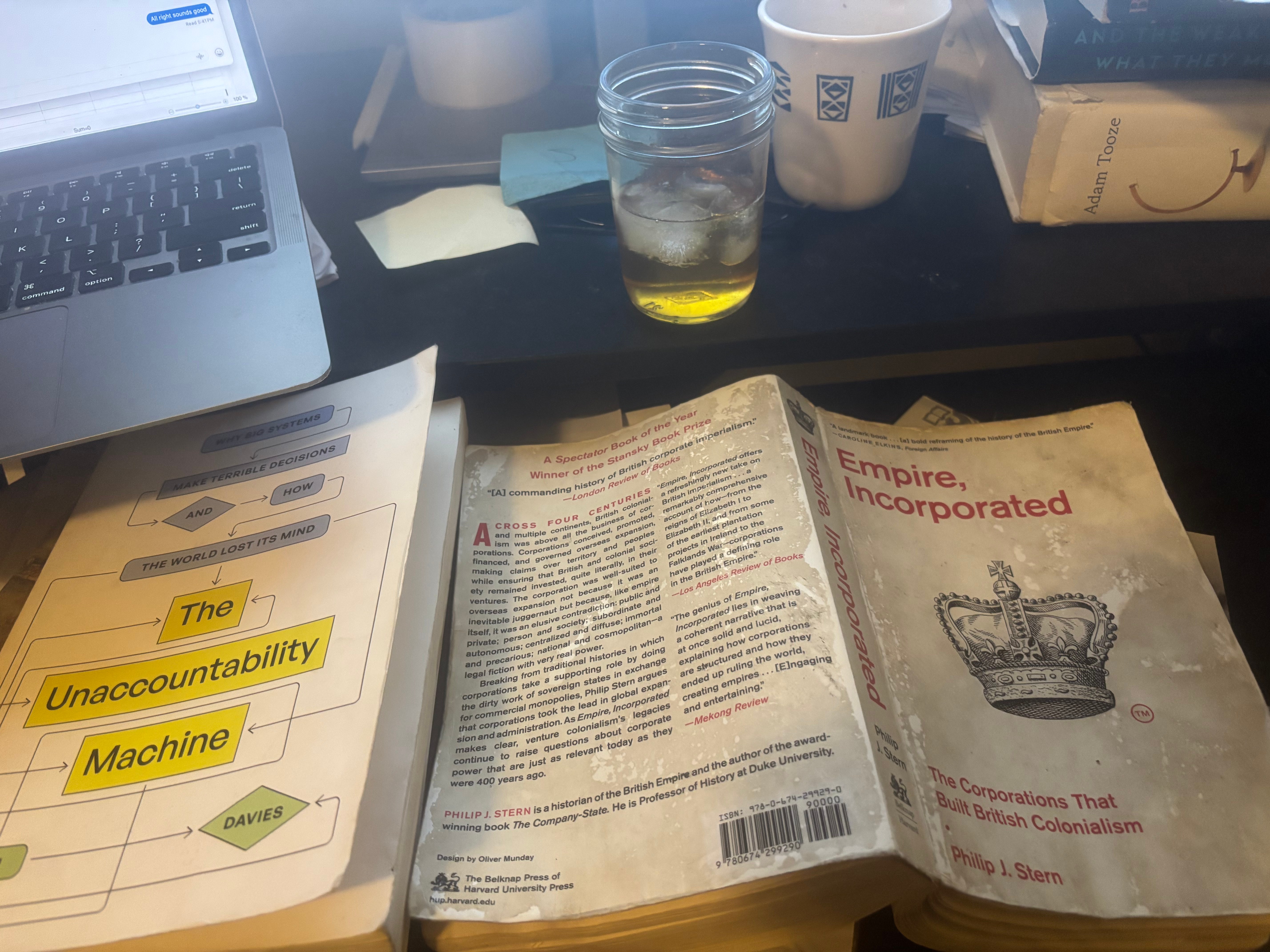
Philip Stern, Empire, Incorporated: The Corporations That Built British Colonialism. This is a comprehensive account of the role of corporations in creating the British Empire over the 16th to 19th century. This is a topic I’ve been interested in for a while but don’t have any real background in, and the book really clarified and reshaped my understanding of it. And as a book, it’s exhilarating. It’s one of those impossibly comprehensive works of history by someone who seems to have read everything, and who has the perfect quote for any topic — the sort of book that makes you think that people in history graduate programs must learn some dark magic for note keeping.
From my point of view, it’s interesting for what it says about the idea that Arjun and I have been working on, as the corporation as a sort of social membrane between the logic of money and markets on the one hand and the socially embedded relationships through which production is actually organized, on the other. From this point of view — which we are hoping to developing in our next book, though I don’t want to put a date on it — the tensions between finance and production, between shareholders and managers, are not a recent historical development. On the contrary, a site of conflict between distinct social logics is just what a corporation is.
Like several other books on this list, this deserves a long essay (and I had started to write one) but in lieu of that here’s a brief summary of some of the most interesting things I took from it.
First, the early modern corporations we are familiar with emerge out of a much broader and more diverse universe of organizations. This is I suppose obvious, but it tends to get effaced in accounts that are focused on the historical roots of modern corporations, which naturally focus on the lineages that survived. But for every East India Company or Hudson’s Bay Company, there are a dozen other joint stock companies organized around some mix of long distance trade and colonization, which weren’t successful enough to make it into most history books.
Maybe more interesting is the diversity of institutional forms. Corporations have always combined public authority with private profit, but the exact mix has varied. One important divide in early colonizing corporations was between what one might call a feudal or seigneurial model, which involved the creation of communities with a distinct identity and local relations; versus a mercantile model in which claims were subdivided without any horizontal connections between franchisees.
From the very beginning, there have been debates about whether corporations should be thought of as an extension of government or a form of private property. An important aspect of this debate was the question of whether corporations were created by public charters or patents, or whether the state was simply recognizing an existing set of relationships, as with the recognition of a marriage; or whether a corporation had no existence independent of the legal act that created it.
This was linked to a larger question of whether sovereignty — legitimate political authority — was sanitary or dispersed throughout society. Or as Stern puts it: “To someone who imagined civil society as a conglomerate of concentric and intersecting corporate bodies … corporations were alternative and natural sites where people might choose to associate and govern themselves, produced in the first instance not by the state but rather by the people that formed them.”
A central argument for organizing trade on the basis of the corporation — a delegation of sovereignty, or a recognition of existing organic connections — was, in the early modern period, a deep-seated idea that Europeans, or Christians (the equivalence of these categories is not a recent development) could not, as individuals, make any kind of agreement with non-Europeans. As Stern writes, paraphrasing Grotius, in Europe there was an existing political order that made private contracts possible; but “outside of Christendom,” Europeans could only make contracts unless they could first “bind themselves into a social contract under the protection of corporations.”
Historically, the corporate charter is cognate with both constitutions and patents; like the former, it was the basis of a delineated form of political authority, like the latter it gave exclusive rights to commercial activity in a certain sphere. Historically, there was a great deal of overlap in the language and legal forms used for each of them. Seeing the patent, the corporation and the constitution as variations on the theme of delegated sovereignty, is one of the more valuable things I got from this book.